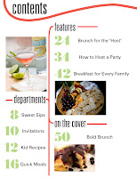
Last week we had to propose designs for prototype magazines for a publisher that cannot be revealed. We once again were in a competition with each other, although in smaller groups. Here are the designs I came up with, a couple cover ideas, a TOC, a department page and feature. I think once we start laying out some copy with the publishers and getting an idea of what they really want we'll be able to get down to a more solid and cohesive design.
Wednesday, March 3, 2010
Critique: Prototype Design
Last week we had to propose designs for prototype magazines for a publisher that cannot be revealed. We once again were in a competition with each other, although in smaller groups. Here are the designs I came up with, a couple cover ideas, a TOC, a department page and feature. I think once we start laying out some copy with the publishers and getting an idea of what they really want we'll be able to get down to a more solid and cohesive design.
Subscribe to:
Post Comments (Atom)


I LOVE the prototype! This makes me hungry - I would totally pick this up from a newsstand. I like how you have a common theme throughout the pages of the mag (similar typography, pink ribbon on the top, etc).
ReplyDeleteYour prototype looks amazing. I am excited to work with you and Laura on the rest of the magazine based on your design. Your concept flows extremely well throughout the whole thing.
ReplyDeleteunivers? umm..yes please. I love the cover you came up with. It's fresh and fun.
ReplyDeleteYour ampersand is adorable and green and turquoise are probably my two favorite colors!
ReplyDeleteI really liked your other logo, although I understand that the "b's" are confusing. I hope you find a way to incorporate all of the lines into your magazine because I thought it was good tie.
ReplyDeleteI loved loved loved your prototype. You did such a great job working on it in our soc class! I want that univers typeface!
ReplyDelete